1. New Initiatives view
With this feature, users can visualize Initiative properties right on the Initiatives preview, including: type, subtasks, custom fields, size, tag, comments, external link, priority, cyle & logged time, deadline, links.
![]()
The Initiative view below shows each icon that corresponds to an initiative property, numbered 1 to 12.
Important: Icons appear only when a corresponding property value is set. For example, if there are no subtasks or custom fields' entries, the icons will be hidden.
![]()
(1) Type - hover over the icon to see the current Initiative type. Click once to change the type.
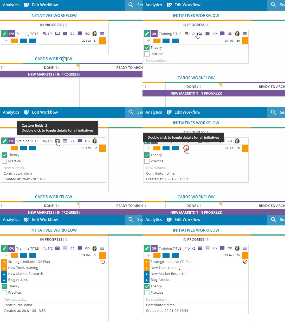
(2) Subtasks - click once on the Subtask icon to display all subtasks of the Initiative. Double click to toggle subtasks for all Initiatives. To close the details, click the icon again or refresh (F5) your board.
(3) Custom Fields- click once on the icon to display all custom fields for the Initiative. Double click to toggle custom fields for all Initiatives. To close the details, click the icon again or refresh (F5) your board.
(4) Size - hover over the icon to see how big the task is. Click once to re-size the Initiative.
(5) Tag - hover over the icon to see the tag name. Click once to change the tag and set it up.
(6) Comment - hover over the icon to see the number of comments. Click once to open the Comments section of the Initiative.
(7) External Link - hover over the icon to see the external link. Click once to open a box and change it.
(8) Priority - hover over the icon to see the Initiative priority.
Note: The priority icon displays when card priority is set to: low, high, critical. When the priority is set to "average" the icon is not visible.
(9) Cycle Time - the icon displays card Cycle time. Click on it to open the card Metrics tab.
(10) Logged Time - the icon displays logged time for this card. Click on it to open the log time panel for additional entries.
(11) Deadline - the icon displays the Initiative deadline. Click to open the calendar picker.
(12) Links - there is no change in the visualization, compared to the previous product version. Each child card, linked to the Initiative, is represented by a colored rectangle.
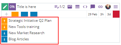
The change we made improves the overview visibility of all card's links, irrespective of the link type. Click the empty space next to the last rectangle to display all existing links (parent, child, relative, successor, predecessor) of the respective card. To close the list of links, click on the same area again or refresh (F5) your board.
Click on the icons numbered (1) Subtasks, (3) Custom fields, (12) Links to have a combined view of the respective properties. To close the details, click the icons again or refresh your board.
2. "Filter links hierarchy" from the Context menu
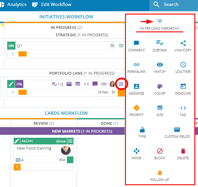
The new "Filter links hierarchy" functionality works for both cards and Initiatives.
It is located in the Context menu and works per board. Use the filter of an item to display all cards and initiatives linked to it. This helps users to gain an insight into the item's relationships on the board.
The feature filters all the child, parent, and grandparent cards in the existing hierarchy from: grandparent cards at the highest level to child cards at the lowest level in the hierarchy.
3. Timeline workflow improvements
The latest changes in the Timeline workflow improve visualization and user experience with the timeline initiatives.
- Better visibility of start and end date
Hover over any of the Timeline initiatives and the linear calendar on the top of the workflow will instantly display its start and end day. The dates will be outlined in blue for better visualization.
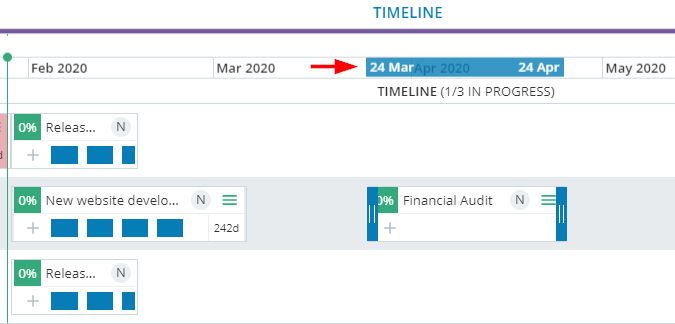
- Board filter in Timeline Workflow
Up to the new version, the Board Filter selections affected only what is displayed on the board.
Now the selection on the Board Filter is also reflected in the Timeline workflow.
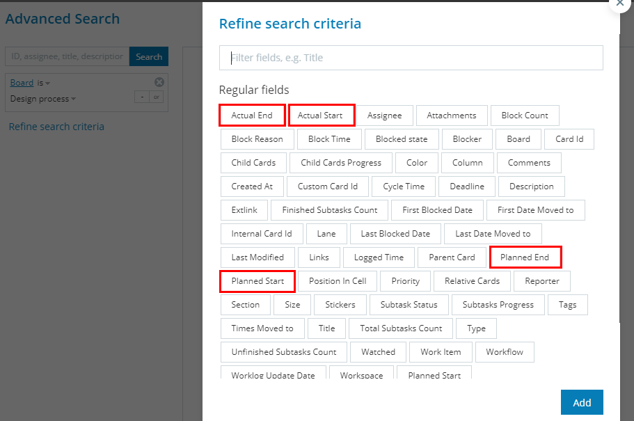
- Timeline-related dates in the Advanced search tool
The Timeline Initiatives are bound to the calendar by a set of time-related properties that define the planned start and end dates against the actual ones. These properties are now available as selections in the Advanced search tool to improve the system reporting capability.
4. Excel import improvements
Using Excel to populate your Kanban boards is becoming a commonly used method.
With Release 6.21, the Excel import capabilities cover even more scenarios. Users may perform the following actions, using Excel:
- Create new cards and link them as 'child' to existing items by 'Custom ID'.
When formatting the Excel file, users need to provide the 'Custom ID' value (of an existing card or initiative) as a unique identifier in the Parent column.
After a successful import, the newly created card will be in a parent/child relationship with the item corresponding to the 'Custom ID' from the file.

Note: Warning messages alert users for the following conditions during the import.
- > If other card items have the same 'Custom ID', the uploaded file will create more than one parent/child link.
- > When some of the cards matching by Custom ID in the 'Parent' column are on another board.

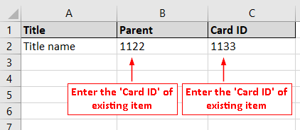
- Link two existing cards or initiatives by 'Internal ID' or 'Custom ID'
Format the Excel spreadsheet and create two columns 'Parent' and 'Card ID'. Enter the internal or custom ID of two existing items. After the import, there will be parent/child relationships between them. Parents become those items, which values have been entered in the respective column.
5. 'Custom ID' visual enhancements
Several improvements have been made to the 'Custom ID' field in terms of visualization.
- The 'Custom ID' now becomes visible to the closed view of all Initiative items.
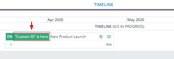
- When the custom value for the ID is too long, it will be still visible on the card or initiative, limited to the items' size. Longer custom ID values override the respective Assignee icon to use the extra space. When the custom ID is even longer, open the item to see the full value.
- The 'Custom ID' values are now available within the "Timesheet per user" report results and "Worklog per card" report results.
6. Other product Improvements
We delivered some more enhancements in different product areas that will improve your experience with Kanbanize. Here is the list of changes:
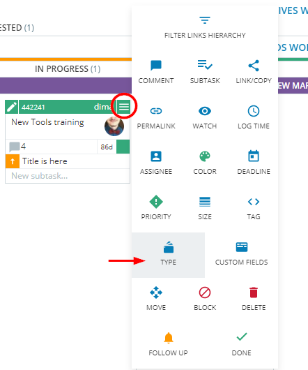
- Set up card type from the Context menu
Card types are now accessible from the card Context menu. Users can quickly set up or change the type of single or multiple cards. To add a type, open the Context menu and select the respective icon. It opens a box with all types, assigned to the board.
- Block reason comment stored in card history
The Generic card blocker always goes with a block reason comment. Even though the comment field is not mandatory for the rest of the blockers, many users provide valuable information right there. With Release 6.21, when the card is unblocked, the free-form text will retain as an entry in the card History log. Users can refer back to it during retrospectives and team discussions on process improvements.
- Quickly find contact information
More often than not, the regular Kanbanize users need to get in touch with Workspace managers and other Board members. The sidebar "Invite Users" panel displays all Board Members and Workspace Managers for the respective board. Hover with your mouse pointer over any avatar to bring their names and email addresses to display.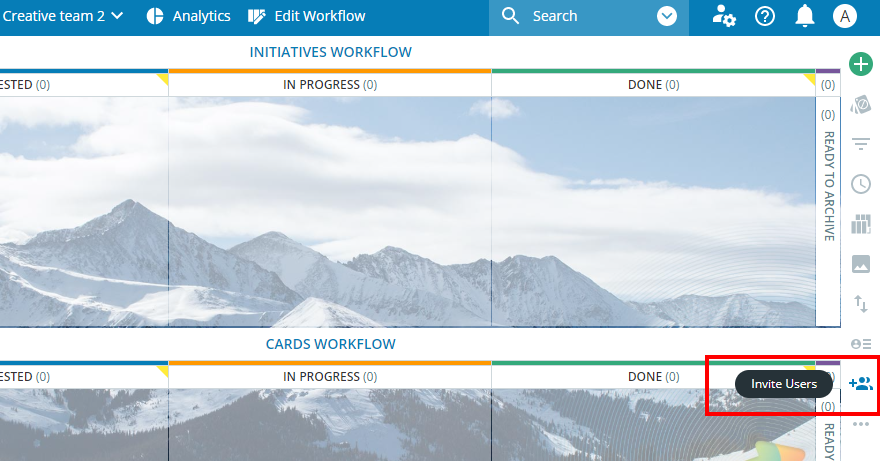
7. Mobile improvements
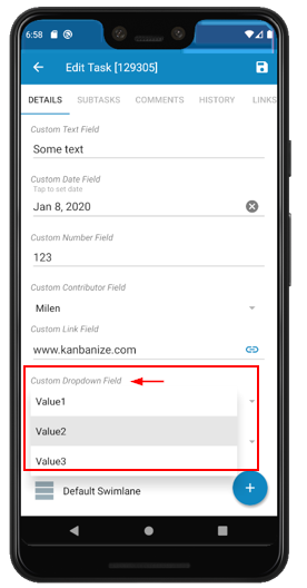
This has been a much-requested feature for our Android app. The new Kanbanize version shows and allows to edit the custom fields added to a card.
