In this article:
1. Introduction to the Cycle Time Histogram
2. How does this chart work?
3. What's that telling us?
You can find more information about the Analytics module in the dedicated article.
1. Introduction to the Cycle Time Histogram
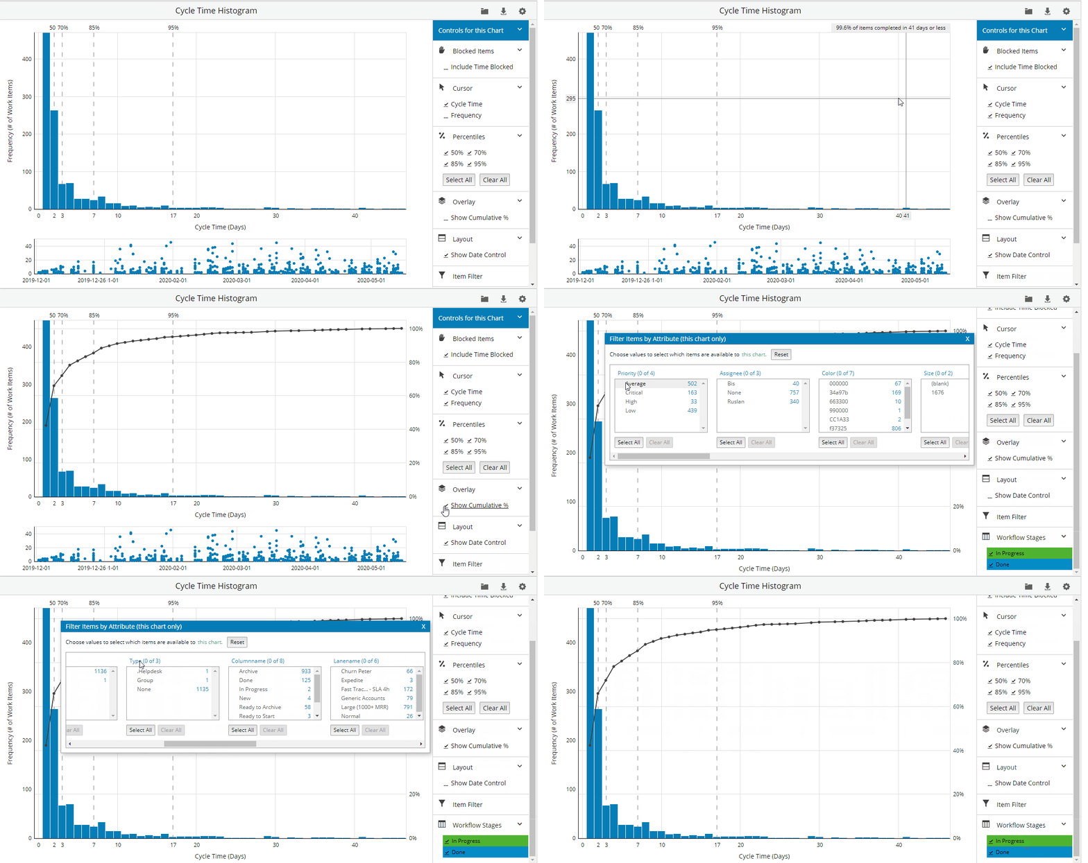
The Cycle Time Histogram is similar to the Cycle Time Scatterplot, but it visualizes the data differently. The Cycle Time Histogram aggregates the data and gives you the cycle time-frequency distribution of the completed cards in your workflow.
You can learn more about the Cycle Time Histogram concept in our blog.
Dataset Configuration
To filter your data, use the Dataset Configuration menu on the left side of the histogram. You have to select at least one of the following fields — Created at, Start Date, or End Date, and at least one workflow.
You have two additional options:
- Ignore the cycle time configuration for the selected workflow(s) — enable this if you want the system to disregard the cycle time settings for the workflow(s) you have selected.
- Ignore the block time in the queue columns — enable this if you don't want the system to account for the time cards were blocked while they were in queue columns.
2. How Does This Chart Work?
Across the "x" axis is a representation of time, i.e. Cycle time.
On the "y" axis is the number of work items.
You have to enable the percentiles in order to get the probabilistic view of the histogram.
Controls for this chart - customize your view
You can use the controls to change the "Cycle Time Histogram" simulation view and to apply additional filters. Please, check the short video below.
- Blocked items - include blocked time for the cards.
- Cursor - you can use the cursor options to display the cycle time, frequency, or both for the current position of your mouse cursor.
- Percentiles - select and deselect percentiles to get the probabilistic view of the chart.
- Cycle time filter - choose to include blocked time and/or calculate results for work days.
- Overlay - show the cumulative % of work items completed in X days or less.
- Layout - show/hide data control that allows you to zoom in and out of a specific interval within the selected time frame.
- Item Filter - filter your account data to display a smaller portion of data that you need to analyze.

3. What's That Telling Us?
The histogram shows us the distribution of cycle time-frequency of all completed cards on the selected workflow. Percentile lines show the probability that your team will complete a task within a certain cycle time.
When we look at the chart we can say that:
- 50% of the working items in that workflow are usually completed in 2 days or less.
- 70% of the working items in that workflow are usually completed in 3 days or less
- 85% of the items in that workflow are usually completed in 7 days or less
- 95 % of the items in that workflow are usually completed in 17 days or less
You can use the percentiles to define your service level agreement. To be on the safe side, we recommend considering the 85th or the 95th percentile.
The right side of the Histogram is called “tail” (where the bars are getting shorter). The longer the tale, the worse, because it means that work items can be completed anywhere between 1 day and 40 days.
If your Cycle Time Histogram displays higher bars on the left and a long tail to the right, your process is inconsistent and your cycle time is varying. The reasons might be different: some blockers that slow down your pace, lack of consistency in the breakdown process, or bad sizing.
Tip: You will always have a tail, but try to analyze the reasons, take a deep look at the problematic tasks, and try making the tail shorter. Ideally, you have work items only to the left side.
Important:
The Cycle Time Histogram allows for recalculation based on working days.
Note: that the X-axis (where applicable) would still display all calendar days/weeks.
The selection of working days recalculates the cycle time for all cards shown in the graph, but this would not alter their actual completion date on the Histogram for example.
Let's say we have a card that was moved to ‘In Progress’ on a Wednesday e.g. 06.01.2021 and was completed on Saturday 09.01.2021 and the team is working from Monday to Friday.
If no working days option is selected, the card's cycle time would fall under the 4 days cycle time bar on the Histogram.
If working days (Mon-Fri) are selected for the Cycle Time Histogram, the position of that card will change from the 4 days cycle time bar to the one for 3 days.
In case you need precise cycle and log times for internal reporting, use the Advanced search capabilities with the different chart views and widgets.
